-
Dorkyfresh Sketches and Drawings
- Thread starter DorkyFresh
- Start date
Similar threads
Users who are viewing this thread
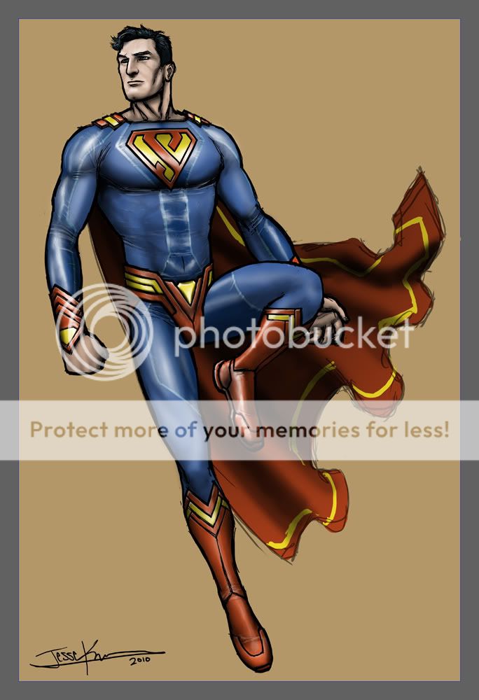
thanks, B. i see what you're sayin'...i was going for a more "infinity" looking symbol though. glad you like the belt!Very nice, but the "S" looks a bit like an 8. I like the belt")
i appreciate ya!Dorky,
Awesome work as always!
CM
yeah i actually quite like the way i came up with the "S". i used to be a fan of no briefs, but Superman's suit just isn't complete without them imo. glad you like the way i made them though. most people don't, saying it looks too much like a jock-strap or thongI like the S much better on the newer one not so pointy. I could still do without the briefs though but if they are gonna be there I like it like this.

another Superman piece...
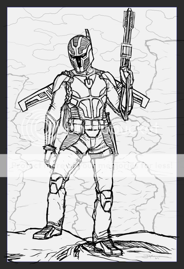
a lil' something i did as a favor. boba fett with a dorkyfresh twist


nope, never did...just lost steam and died. if i ever revisit it, i'll probably start from scratch. the layout could've been better.Did you ever finish that Lord of the rings peice? It was looking **** hot.
thanx, Saint. the seams on his chest probably COULD be a little more creative, but i personally think they work fine.I like this. Superman's sleeves are a real problem--they just sort of end, making his outfit look like a sweater. The changes you made are small, but they really help shift the design away from that. I prefer a solution like this to your other design with the red cuffs. The legs and boots are also really sharp.
I'm not sure the seams on the chest are working, though.
thanks a bunch, much appreciated!I love how you mixed the shiney blue with the matte, and the yellow in the cape's pretty cool... but i think the second one is awesome. the chest seams work for me actually. the boots, the cuffs, belt the 's', all dope. it's a great update to the costume without re-inventing it.
kudos!
much thanks Marx!I love this! Great work!
wow Hellion, quite the compliment! hehe...i appreciate that.Awesome...its like...gazing upon angels...


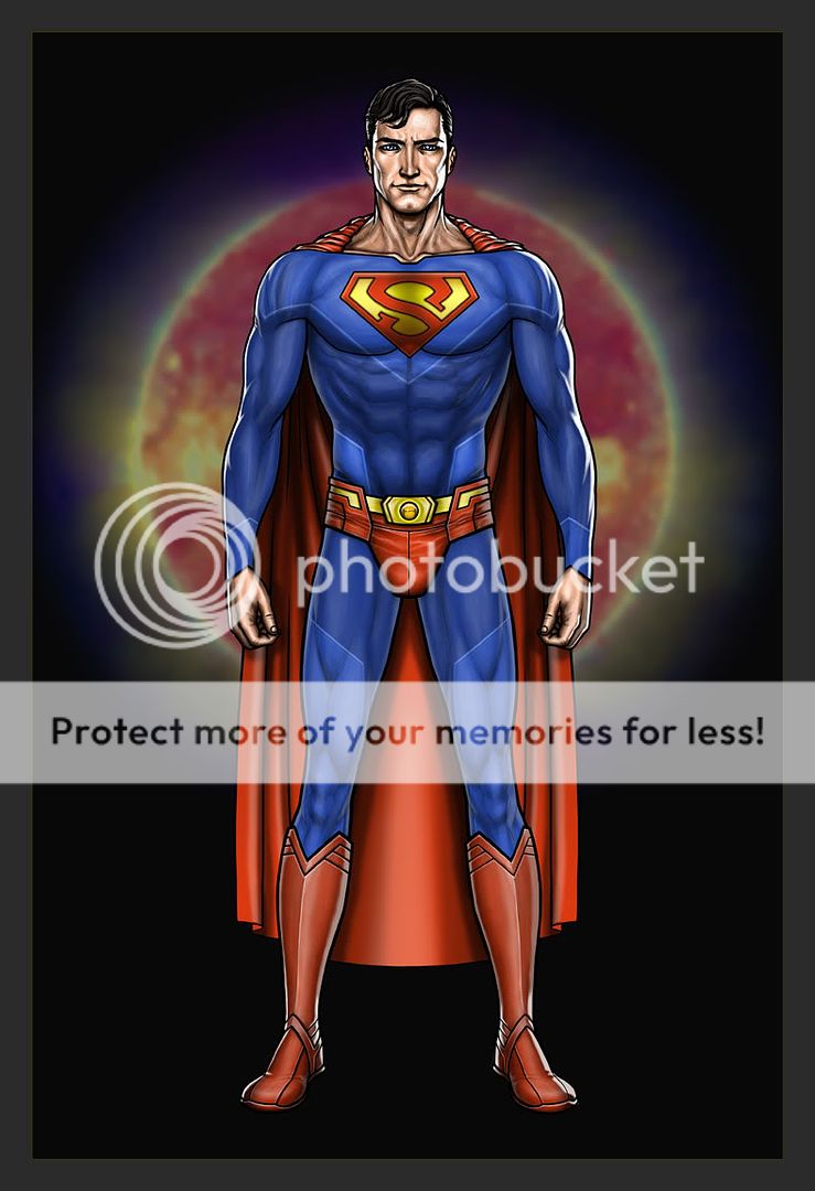
thanks guys!! here's another piece that i was inspired to do once they announced that they're rebooting Superman...