What is the definitve look of the Batsuit?

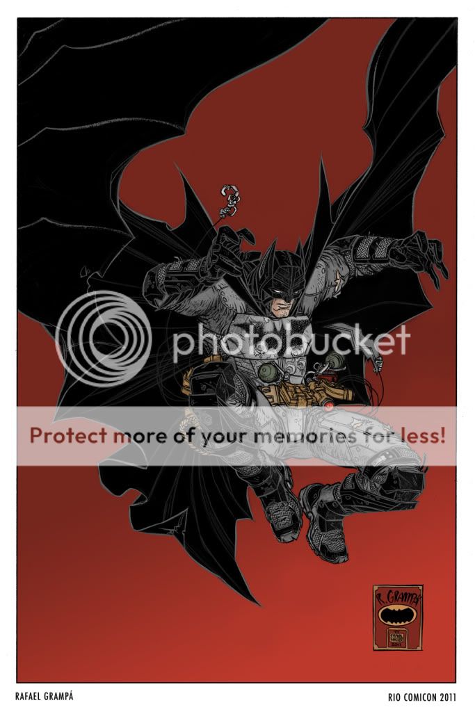
The definitive suit is impossible to choose. But a couple of favourites are below.

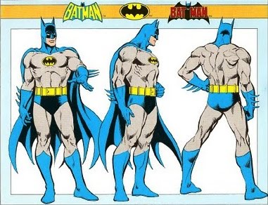
The classic blue and grey I grew up with, mostly thanks to the one and only master: Neal Adams. Of course, the way he often used Batmans cape in his amazing art is yet to be seen today, regardless of colours or design.

neilbatmanhalfanevilpag.jpg


Batman/Batman Returns: Thanks to Tim Burton and Michael Keaton (and of course all the designers in this production whom are always forgotten). I have a slight problem with the design of the Batsymbol at the chestplate, otherwise it's just perfect as a movie suit. In Returns the Suit is slightly modified, but I think both are as good.


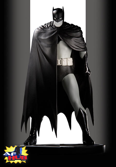
Batman Year One: Mazzucchelli's (tough name to spell right) simplyfied vison in grey and black is simply perfect. OK, his over all astonishing art in BYO also helped to sell this Batsuit. it's a nice nod to the earliest version of Batman in the late 30:s as well.


And of course, back in the early days of shooting Batman, they knew what colours and design who would work best at the celluloids. ;)

 
Last edited:
His art wasn't really that good anymore at that time. Much weaker than in the 70s.
Yeah, unfortunately Jim Aparo seemed to have lost it a bit after the 70:s.

Perhaps a bit OT in this thread, but this is the Jim Aparo I love (and actually read that issue back in the day as a snotty little kid):

 
Batman-Arkham-City-70s-Batsuit.jpg


This pretty much.......tho the blue should be a darker navy blue, and the cape perhaps more voluminous, tho not longer, I don't care for the dragging on the ground cape. Definitively the bat like scalloping of the cape should always be evident; dragging on the gound negates that.
Definitively the eyes should be blank white lenses, tho I realize in "live action" that may not work.

And...........The suit should never ever "look" like armor!
 
I love the Jim Aparro for early stuff but I hate the oval on newer stuff. Also, i can't stand any of the Burton era suits. The Dark Knight suit is my fav movie suit.
 
The one thing that bothers me the most about the films is this: I want blue. We've never gotten it. I'm not asking for the 70s costume / Neal Adams stuff - I'm simply asking for blue incorporated in some way.

I also think the Bat symbol on the chest should be darker/blacker than the suit. That doesn't mean that the suit should be light grey, but a dark grey armor like in Batman Begins would be perfect (for me).

I would absolutely adore something like this, with a slightly darker tone:

batman.jpg
 
you know the bat suit was never technically blue right? it was the way comics were printed where if it was black you couldn't see shading. same reason why superman's hair was blue.
 
you know the bat suit was never technically blue right? it was the way comics were printed where if it was black you couldn't see shading. same reason why superman's hair was blue.

I do know that. :word:
I just prefer blue, and would like to see it in just one movie.
 
Personally, I think a busy belt is fine, considering the amount of equipment he claims to carry, but I can see where you're coming from.
 
The one thing that bothers me the most about the films is this: I want blue. We've never gotten it. I'm not asking for the 70s costume / Neal Adams stuff - I'm simply asking for blue incorporated in some way.

I also think the Bat symbol on the chest should be darker/blacker than the suit. That doesn't mean that the suit should be light grey, but a dark grey armor like in Batman Begins would be perfect (for me).

I would absolutely adore something like this, with a slightly darker tone:

batman.jpg

No thank you to the blue. Black looks much better on Batman, in my opinion.
 
Blue, black or something in between, it all depends on context for me. I've loved versions of the Bat-suit with all kinds of color schemes.
 
I like a blue that's so dark it looks black in most lights, like the cape in the Arkham games.
 
you know the bat suit was never technically blue right? it was the way comics were printed where if it was black you couldn't see shading. same reason why superman's hair was blue.
That hasn't been true for a while. At some point the costume did transition to full-on blue. It is most apparent with Neal Adams' art and even the suit worn by Adam West.

I think it would be interesting to see a live-action take on that color scheme, if only because it has more than established its prominence in the mythos that it's already embedded in every reader's head.
 
I'd say Arkham City got it perfect ...

batmanaa4thegroup001.jpg


Perfect mix of black, grey, and vaguely blue in the right light. Cowl is a good shape. Solid gauntlets and boots. Good emblem. No oval. I think the Arkham Batman is the definitive look.

SnakeDoc
 
I love all suits who look a bit like armour, are black and grey (or a very dark shade of blue) and have the old pouch belt. Ears not too short and not too long and I like it when his fingertips are somewhat pointy, clawlike. The cape has to be huge and iconic.

What matters much more for me is Batmans figure. I really hate it when he's drawn like a huge bodybuilder, wearing a spandex suit. HATE THAT! :cmad:

I really love how Jock or Frank Quietly drew Dick Batmans figure or the way Dustin Ngyuen draws Bruce. He's still huge and imposing but realistic and not hulk-lite.

From the movie suits I like the TDK and Begins suits. Begins suit had such a great frame, with the big neck, but TDK has a cooler Mask. Overall I have to admit that none of the movie suits really nailed the look for my taste.

Arkham Suit was good for the videogame but here he looks to bulky for my taste, but I really dug the bulletproof look.
 
Everything Brian Bolland illustrates is definitive to me.
 
That hasn't been true for a while. At some point the costume did transition to full-on blue. It is most apparent with Neal Adams' art and even the suit worn by Adam West.

I think it would be interesting to see a live-action take on that color scheme, if only because it has more than established its prominence in the mythos that it's already embedded in every reader's head.

Though the Adam West suit was much darker than the one in the comics.
 
I think this is the definitve, most iconic, and most well known version of the Batsuit ever.
NealAdamsBatman.jpg
 
It's great seeing the 70's Grey and Blue outfit getting respect. It really is Batman's most iconic outfit, IMO. The Burton outfits were basically designed like the 70's outfit, just painted black.
 
There is no definitive look of the Bat-suit – it's all a matter of context.
 
For me, definitive Batsuit is the Year One one. Loved it and it has endured almost for the longest, in continuity.

Batman-Year-One.jpg


batman_bw.jpg


I have to say, and I know I am about to get my butt kicked for it, but I really never ever understood the Neal Adams hype at all. Never liked his drawing style and really disliked his Batman. He looks to superheroic for my taste, not enough urban myth, scary vigilante. I'm sorry, but I really don't like the Adams suit.
 

Users who are viewing this thread

Back
Top
monitoring_string = "afb8e5d7348ab9e99f73cba908f10802"