You are using an out of date browser. It may not display this or other websites correctly.
You should upgrade or use an alternative browser.
You should upgrade or use an alternative browser.
The Daily Planet - Superman News and Speculation Thread
- Thread starter flickchick85
- Start date
- Joined
- Aug 24, 2011
- Messages
- 52,707
- Reaction score
- 25,910
- Points
- 118
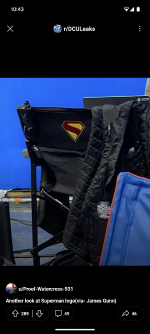
That same tech is used to prevent such leaks... Apparently.I find it fascinating with all the technology and social media around all we have as an official full logo reveal is a crappy blurry photo from the screen of a presentation.
hopefuldreamer
Clark Kent > Superman
- Joined
- Jun 20, 2010
- Messages
- 12,357
- Reaction score
- 927
- Points
- 73
I agree, I think it's super weird they haven't sent round an 'official' look at the logo. It makes all the comparisons a bit unfair, as it's being judged on a poor quality shot.I find it fascinating with all the technology and social media around all we have as an official full logo reveal is a crappy blurry photo from the screen of a presentation.
DyeLorean
...and the plot thickens
- Joined
- Dec 17, 2006
- Messages
- 8,572
- Reaction score
- 4,160
- Points
- 103
Well is like they try so hard to keep things "under wraps" and from leaking and so forth, and when the time finally comes then they just drop the ball. We don't even have a clean looking logo but an incomplete basketball version up close and a low-res image someone happened to take a picture of. It's so weird.
There was A LOT of talk about the Fantastic Four and then Marvel just went "Ok, here's the logo, here's the final cast, here are the costumes, happy? Now wait for it".
There was A LOT of talk about the Fantastic Four and then Marvel just went "Ok, here's the logo, here's the final cast, here are the costumes, happy? Now wait for it".
Babillygunn
New Age Outlaw
- Joined
- Nov 26, 2014
- Messages
- 5,394
- Reaction score
- 7,577
- Points
- 118
Maybe because they are fundamentally very similar interpretations/characterizations.Alex Ross designed that S for the Superman from the Kingdom Come story.
Still don't understand why they're giving it to a (supposed) Superman inspired by For All Seasons / All Star.
It’s not like a director who thinks it is a great idea to create an amalgamation of Death of Superman/All Star/ and Injustice.
Captain Tired
coupon day!
- Joined
- Oct 14, 2014
- Messages
- 6,265
- Reaction score
- 8,523
- Points
- 103
I don't know why the idea of mixing and matching different attributes or aesthetic variations is so foreign to people. It's the one instance of fans being parochial that I don't get at all. 
- Joined
- Aug 24, 2011
- Messages
- 52,707
- Reaction score
- 25,910
- Points
- 118
I don't know why the idea of mixing and matching different attributes or aesthetic variations is so foreign to people.
Captain Tired
coupon day!
- Joined
- Oct 14, 2014
- Messages
- 6,265
- Reaction score
- 8,523
- Points
- 103
Well I personally love this plan! I'm excited to be a part of it!
Sawyer
Definitely Not 40
- Joined
- Apr 4, 2004
- Messages
- 110,083
- Reaction score
- 20,912
- Points
- 203
I find it fascinating with all the technology and social media around all we have as an official full logo reveal is a crappy blurry photo from the screen of a presentation.
Betting Gunn drops it officially with the suit reveal.I agree, I think it's super weird they haven't sent round an 'official' look at the logo. It makes all the comparisons a bit unfair, as it's being judged on a poor quality shot.
- Joined
- Aug 24, 2011
- Messages
- 52,707
- Reaction score
- 25,910
- Points
- 118
I wonder if it will use the comics font like the Legacy logo does.Betting Gunn drops it officially with the suit reveal.
Babillygunn
New Age Outlaw
- Joined
- Nov 26, 2014
- Messages
- 5,394
- Reaction score
- 7,577
- Points
- 118
I am all for it, so long as it keeps to the core attributes of the character. But when you try to introduce elements of Injustice (where he is the villain) into a main line Superman film just because you think he will be more interesting with an edge, then I think that’s a disservice.I don't know why the idea of mixing and matching different attributes or aesthetic variations is so foreign to people. It's the one instance of fans being parochial that I don't get at all.
I’m kind of in the Mark Waid camp when he said that “at this point the bar has been lowered so much that if you make a Superman movie where he isn’t killing someone, you’ve made a good, respectable film.”
Captain Tired
coupon day!
- Joined
- Oct 14, 2014
- Messages
- 6,265
- Reaction score
- 8,523
- Points
- 103
I was mainly just talking to the appropriation of the KC-style logo lol, but sure, I agree with all of that, too.I am all for it, so long as it keeps to the core attributes of the character. But when you try to introduce elements of Injustice (where he is the villain) into a main line Superman film just because you think he will be more interesting with an edge, then I think that’s a disservice.
I’m kind of in the Mark Waid camp when he said that “at this point the bar has been lowered so much that if you make a Superman movie where he isn’t killing someone, you’ve made a good, respectable film.”
OrbOfConfusion
Sidekick
- Joined
- May 21, 2023
- Messages
- 1,158
- Reaction score
- 1,485
- Points
- 78
Hard to think, but not unbelievable, that Warners looked at this and went 'That's great work, Joss! Let's put it out there!'Posting screenshots of cinematic Superman portrayals each day until we get an official look at David as Superman (Day 8).

- Joined
- Aug 24, 2011
- Messages
- 52,707
- Reaction score
- 25,910
- Points
- 118
Remember Cap in The Avengers...Hard to think, but not unbelievable, that Warners looked at this and went 'That's great work, Joss! Let's put it out there!'
Sawyer
Definitely Not 40
- Joined
- Apr 4, 2004
- Messages
- 110,083
- Reaction score
- 20,912
- Points
- 203
I’m sensing a certain lack of curiosity in those opposing the Kingdom Come emblem.
I could see finding it odd that Gunn opted to go with a piece of iconography associated with an older Superman for this early Superman story, but don’t you at least figure the man has his reasons?
I could see finding it odd that Gunn opted to go with a piece of iconography associated with an older Superman for this early Superman story, but don’t you at least figure the man has his reasons?
Alien Anal
Sidekick
- Joined
- Jan 15, 2007
- Messages
- 4,473
- Reaction score
- 988
- Points
- 73
- Joined
- Jun 16, 2007
- Messages
- 54,193
- Reaction score
- 54,208
- Points
- 218
Meanwhile I'm over here saying "f*** Kingdom Come, that's the Warworld Saga emblem!"I’m sensing a certain lack of curiosity in those opposing the Kingdom Come emblem.
I could see finding it odd that Gunn opted to go with a piece of iconography associated with an older Superman for this early Superman story, but don’t you at least figure the man has his reasons?


And yes I realize Gunn has been posting pics of Kingdom Come from the get-go, and almost certainly got it from that, but Warworld was probably the best Superman run of the last decade (or two) so let me have this!

- Joined
- Jun 16, 2007
- Messages
- 54,193
- Reaction score
- 54,208
- Points
- 218
emielaen
Sidekick
- Joined
- Jan 2, 2020
- Messages
- 3,212
- Reaction score
- 3,524
- Points
- 78
I think he chose that symbol because he likes the look of it. I don't think using the Kingdom Come design but taking inspiration from All Seasons / All Star as far as story or character goes is setting the story up for some sort of clashing nature.
Sawyer
Definitely Not 40
- Joined
- Apr 4, 2004
- Messages
- 110,083
- Reaction score
- 20,912
- Points
- 203
Meanwhile I'm over here saying "f*** Kingdom Come
- Joined
- Aug 24, 2011
- Messages
- 52,707
- Reaction score
- 25,910
- Points
- 118
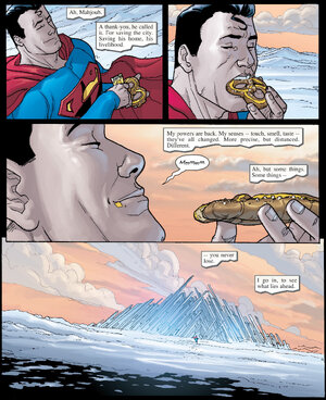
Please tell me Clark isn't polluting the arctic.Posting Superman pages/panels I love every day until we get our first official look at David Corenswet as Superman, Day 9:
View attachment 86941

- Joined
- Aug 24, 2011
- Messages
- 52,707
- Reaction score
- 25,910
- Points
- 118
Dr.
From parts unknown
- Joined
- Aug 19, 2010
- Messages
- 6,395
- Reaction score
- 3,485
- Points
- 103
Since the late Golden Age, the “S” in the Superman symbol has been stylized. This has varied by artist or era. But fair to say that the degree of stylization can impart a certain graphical “ambiguity” to the symbol. And, arguably, this has contributed to its iconic fame. Also (and I’m speculating), this eventually led to the retcon notion that the  could plausibly pass for an alien glyph which “coincidentally” resembled the letter “S.”
IMO, the Gunn/KC version of the symbol is starkly minimalist. So taken in isolation, the thick diagonal bar doesn’t immediately convey the idea of an “S.” Of course, it won’t be in isolation. For one thing, it’ll be framed within the familiar pentagon shape. For another, it’ll be affixed to guy in a blue bodysuit and red cape. I.e., no one will be confused by the symbol.
The new is fine.
 could plausibly pass for an alien glyph which “coincidentally” resembled the letter “S.”
IMO, the Gunn/KC version of the symbol is starkly minimalist. So taken in isolation, the thick diagonal bar doesn’t immediately convey the idea of an “S.” Of course, it won’t be in isolation. For one thing, it’ll be framed within the familiar pentagon shape. For another, it’ll be affixed to guy in a blue bodysuit and red cape. I.e., no one will be confused by the symbol.
The new
Babillygunn
New Age Outlaw
- Joined
- Nov 26, 2014
- Messages
- 5,394
- Reaction score
- 7,577
- Points
- 118
Excuse me while I go visit the “It’s a bird, it’s a plane, David Corenswet is The Unbloodied Sword” thread.Meanwhile I'm over here saying "f*** Kingdom Come, that's the Warworld Saga emblem!"

And yes I realize Gunn has been posting pics of Kingdom Come from the get-go, and almost certainly got it from that, but Warworld was probably the best Superman run of the last decade (or two) so let me have this!
Last edited:
Primal Slayer
Let the Siren scream
- Joined
- Jun 30, 2005
- Messages
- 27,617
- Reaction score
- 5,976
- Points
- 103
All they cared about at that point was their bonuses.Hard to think, but not unbelievable, that Warners looked at this and went 'That's great work, Joss! Let's put it out there!'
Similar threads
- Sticky
- Replies
- 819
- Views
- 67K
The Avengers
Avengers World Premiere Live Thread
- Replies
- 297
- Views
- 9K
- Replies
- 1K
- Views
- 71K
The Amazing Spider-Man
Spider-Man(TRB): News and Speculation
- Replies
- 62
- Views
- 9K
Guardians of the Galaxy
Guardians of the Galaxy Deleted Scenes Thread
- Replies
- 1
- Views
- 982
Users who are viewing this thread
Total: 11 (members: 0, guests: 11)
Latest posts
-
-
-
-
-
Discussion: Online Piracy, Net Neutrality, Killswitch, and Other Internet Issues II (2 Viewers)
- Latest: blueharvest


