If I were Marvel, I wouldn't do another one because another poster is not going to be as clean, evoking, or compelling as this one sheet.
It's perfect. This is the announcement, teaser, international, and theatrical poster...if I'm running Marvel.
Job done!


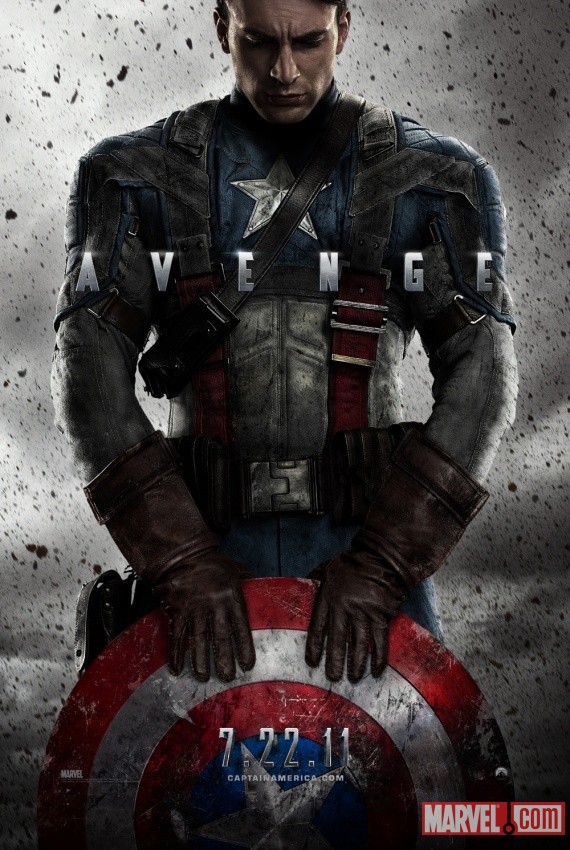


 That'll do, Marvel. That'll do.
 t:
t:")