- Joined
- Aug 24, 2011
- Messages
- 52,439
- Reaction score
- 25,663
- Points
- 118
With his color scheme Wade could absolutely fit in with these three mofos.


With his color scheme Wade could absolutely fit in with these three mofos.
It's like Timm doesn't see how wrong the pairing is. Let alone Dick and her dated too. 😵💫I remember that episode of Batman Beyond when Babs spilled the tea about her and Bruce to Terry... all over coffee.
View attachment 89679
Bruce and Babs are big bro/little sis, anything else is just sick.
View attachment 89680
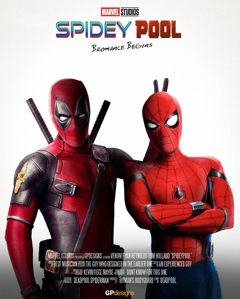
Imagine this with Andrew's Spidey and Tom Hardy's Venom in the same movie. But the studio execs won't let it happen because they're allergic to fun.
So much teasing with their characters and nothing still! 😭Imagine this with Andrew's Spidey and Tom Hardy's Venom in the same movie. But the studio execs won't let it happen because they're allergic to fun.
I have to imagine there'll be some sort of Spidey tease in Deadpool & Wolverine but along the lines of "legally we're not allowed to use him" or something.So much teasing with their characters and nothing still! 😭

I have to imagine there'll be some sort of Spidey tease in Deadpool & Wolverine but along the lines of "legally we're not allowed to use him" or something.
Or alternatively, maybe they could give us a Spooderman cameo. He's probably fair game.
View attachment 89682

Speaking of this, I always hated Selina's redesign in TNBA and would have preferred this:It's like Timm doesn't see how wrong the pairing is. Let alone Dick and her dated too. 😵💫
It was just as bad as that episode where Selina seduces Nightwing to help her with a mission.
Speaking of this, I always hated Selina's redesign in TNBA and would have preferred this:

A great Harlivy episode... It also shows how Ivy's willing to hold off the ecoterrorism for Harley. ♥️
And Scarecrow, who they turned into pure nightmare fuel. On brand for the character but unbelievable that they signed off on it since they basically watered down every other character to seemingly make them more kid-friendly and fit in better with the Superman TAS style.

Crane actually looks pretty damn intimidating here.And Scarecrow, who they turned into pure nightmare fuel. On brand for the character but unbelievable that they signed off on it since they basically watered down every other character to seemingly make them more kid-friendly and fit in better with the Superman TAS style.
View attachment 89684
Superman putting on boots in the middle of destruction is precisely what makes it seem not that serious to me. I dunno. If the intent were actually to showcase how dark the plot and setting supposedly are, actually having him in the thick of the chaos would make more sense.I mean is it reeeeeeeallly a reach when they release a picture of a city in chaos with a seemingly less than enthused Superman taking his time to put on his boots all in the cloak of night?
I don't have a dog in the fight, but Gunn is giving off dour vibes, he can't get mad at people for picking up what he put out.
And Scarecrow, who they turned into pure nightmare fuel. On brand for the character but unbelievable that they signed off on it since they basically watered down every other character to seemingly make them more kid-friendly and fit in better with the Superman TAS style.
View attachment 89684
I also liked the Tim Drake Robin costume from that season.And Scarecrow, who they turned into pure nightmare fuel. On brand for the character but unbelievable that they signed off on it since they basically watered down every other character to seemingly make them more kid-friendly and fit in better with the Superman TAS style.
View attachment 89684
I always forget Arkham Scarecrow.Crane actually looks pretty damn intimidating here.

Crane actually looks pretty damn intimidating here.
Unless I'm forgetting something, TNBA Scarecrow might be the most physically imposing of all of them. I liked Arkham Knight Scarecrow too as far as presentation.I always forget Arkham Scarecrow.
I will say that while I'll always prefer the overall designs from the original BTAS, the designs for the hero characters in TNBA were more or less good. I liked the design for Nightwing as well. My only real complaint is that the original Batman yellow oval logo should have been kept on his suit but I get that they were trying to move away from the Burton/Schumacher influence and trying to do their own thing.I also liked the Tim Drake Robin costume from that season.
I very much agree, though I suspect part of the problem was they had all these projects in various stages of development before the wakeup call of Ant-Man bombing, and now they're not sure how to proceed with such a clogged pipeline. I'm sure there is a world where they decided to drop everything not directly connected to the wider Kang storyline, but the fact that audiences seem very lukewarm on it probably makes that unwise (I'm already pretty sick of Multiverse stuff at this point too).Disney needs to dial it down to two Marvel movies a year. Either stick with first week of May and first week of November or May and late July— can’t do all three. Let other studios have their turn.
Yeah, the only new design from that season I remember actively disliking was Joker. Something about those beady little eyes...Unless I'm forgetting something, TNBA Scarecrow might be the most physically imposing of all of them. I liked Arkham Knight Scarecrow too as far as presentation.
I will say that while I'll always prefer the overall designs from the original BTAS, the designs for the hero characters in TNBA were more or less good. I liked the design for Nightwing as well. My only real complaint is that the original Batman yellow oval logo should have been kept on his suit but I get that they were trying to move away from the Burton/Schumacher influence and trying to do their own thing.
The eyes, no lips, way less color than the first design...did anyone actually like it?Yeah, the only new design from that season I remember actively disliking was Joker. Something about those beady little eyes...


The BDSM Bane?Now that I think about it, Bane got a glow up in TNBA.
View attachment 89687
Superman beat him like he stole something in that Knight Time episode.
Ah yes, the safe word costume. Pretty snazzy.Now that I think about it, Bane got a glow up in TNBA.
View attachment 89687
Superman beat him like he stole something in that Knight Time episode.